React Native modal example


The Modal component has many applications. Often it is used as a “window” in which you can perform additional actions, which results can be viewed on the screen. Modal can be used e.g. as a login window, information window or window with options to choose from.

Therefore, we will create two types of this component: Simple modal i modal picker.


Simple modal

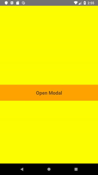
Lets suppose we want user to confirm or reject his choice. We can offer him two options to choose from: Cancel and Ok. Modal will look like this:


We’ll start creating our simple modal by two files: Modal.js and SimpleModal.js. In the Modal.js component state, we specify whether the modal should be visible or not. We will also save the user selection there:

import React, {Component} from 'react';
import {StyleSheet, Text, View, Modal, TouchableHighlight, } from 'react-native';
import SimpleModal from './SimpleModal';

export default class MyModal extends Component {
    constructor(props) {
        super(props);
        this.state = {
            isModalVisible: false,
            choosenData: '',
        };
    }
    render() {
        return (....)
    }
}

We will also create a button (using TouchableHighlight), after clicking which the modal will be visible. We will also create the modal itself, which will be transparent. We will import Modal content from SimpleModal.js

render() {
   return (
      <View style={styles.contentContainer}>
         <Text style={styles.text}>
            {this.state.choosenData}
         </Text>
         <TouchableHighlight onPress={() => this.changeModalVisibility(true)} underlayColor={'#f1f1f1'} 
             style={[styles.touchableHighlight, {backgroundColor: 'orange'}]}>
            <Text style={styles.text}>Open Modal</Text>
         </TouchableHighlight>  
         <Modal transparent={true} animationType="fade" visible={this.state.isModalVisible} 
               onRequestClose={() => this.changeModalVisibility(false)} style={styles.modalContainer}>
             <SimpleModal changeModalVisibility={this.changeModalVisibility} setData={this.setData} />
         </Modal>
      </View>
  )
}

Lets add some styles to make the whole more readable and transparent.

const styles = StyleSheet.create({
    contentContainer: {
        flex: 1,
        backgroundColor: 'yellow',
        alignItems: 'center',
        justifyContent: 'center',
    },
    text: {
        marginVertical: 20,
        fontSize: 20,
        fontWeight: 'bold',
    },
    touchableHighlight: {
        backgroundColor: 'white', 
        alignSelf: 'stretch',
        alignItems: 'center',
    },
    modalContainer: {
        alignItems: 'center',
        justifyContent: 'center',
    }
})

We will now write functions that will control the visibility of the modal and save the selection in the component state:

changeModalVisibility = (bool) => {
    this.setState({ isModalVisible: bool })
}

setData = (data) => {
   this.setState({ choosenData: data })
}

The code for the Modal component is still missing. We want its width matiching the width of the screen but at the same time has margins on the sides. Thats why, we add an event listener to the component Dimensions. We also want to offer two choices: approve and reject our suggestion. We create two buttons – Cancel and Ok. We pass the selection to the state of the parent component (see: how to transfer data from a child component to a parent component) so that it can be displayed on the screen. At the same time, making any choice, we close the modal.

SimpleModal.js

import React, {Component} from 'react';
import {StyleSheet, Text, View, TouchableOpacity, TouchableHighlight, Dimensions } from 'react-native';

export default class SimpleModal extends Component {
    constructor(props) {
        super(props);
        this.state = {
            width: Dimensions.get('window').width,
        };
        Dimensions.addEventListener('change', (e) => {
            this.setState(e.window);
        });
    }

    closeModal = (bool, data) => {
        this.props.changeModalVisibility(bool)
        this.props.setData(data);
    }
    
    render() {
        return (
            <TouchableOpacity disabled={true} style={styles.contentContainer}>
                <View style={[styles.modal, {width: this.state.width - 80}]}>
                    <View style={styles.textView}>
                        <Text style={[styles.text, {fontSize: 20}]}>Sample modal header</Text>
                        <Text style={styles.text}>Sample modal text</Text>
                    </View>
                    <View style={styles.buttonsView}>
                        <TouchableHighlight onPress={() => this.closeModal(false, 'Cancel')} style={styles.touchableHighlight} underlayColor={'#f1f1f1'} >
                            <Text style={[styles.text, {color: 'blue'}]}>
                                Cancel
                            </Text>
                        </TouchableHighlight>
                        <TouchableHighlight onPress={() => this.closeModal(false, 'Ok')} style={styles.touchableHighlight} underlayColor={'#f1f1f1'} >
                            <Text style={[styles.text, {color: 'blue'}]}>
                                Ok
                            </Text>
                        </TouchableHighlight>
                    </View>
                </View>
            </TouchableOpacity>
            
        )
    }
};

We add styles:

const styles = StyleSheet.create({
    contentContainer: {
        flex: 1,
        alignItems: 'center',
        justifyContent: 'center',
    },
    modal: {
        height: 150,
        paddingTop: 10,
        alignSelf: 'center',
        alignItems: 'center',
        textAlign: 'center',
        backgroundColor: "white",
        borderRadius: 10,
    },
    text: {
        margin: 5,
        fontSize: 16,
        fontWeight: 'bold',
    },
    touchableHighlight: {
        flex: 1,
        backgroundColor: 'white', 
        paddingVertical: 10,
        alignSelf: 'stretch',
        alignItems: 'center',
        borderRadius: 10,
    },
    textView: {
        flex: 1,
        alignItems: 'center',
    },
    buttonsView: {
        width: '100%',
        flexDirection: 'row',
    }
})

Yay, works!


React Native modal Picker with ScrollView

It’s turn to modal with more choices, that don’t fit on the screen. Compared to the previous example in Modal.js, we need to make slight changes:

In the component state we add the color option from which will be read the color of the button opening the modal.

Modal.js

this.state = {
    isModalVisible: false,
    color: '',
};

In the setData function we change the name of the parameter:

setData = (data) => {
   this.setState({ color: data })
}

We change styles for modal button:

<TouchableHighlight onPress={() => this.changeModalVisibility(true)} underlayColor={'#f1f1f1'}
                    style={[styles.touchableHighlight, {backgroundColor: this.state.color!=='' ? (this.state.color) : ('orange') }]} >
                    <Text style={styles.text}>Open Modal</Text>
</TouchableHighlight>  

We create a new component called ModalPicker.js and, as before, we adjust its dimensions to the dimensions of the screen, this time both width and height. We create an array with data – in our case these are colors, and using the map () method we return the view with the name of the color for each element in the array. After making any selection, the font color of the selected option changes according to its name. Confirming the selection with the Choose color button, we send information about the selected color to the parent component and close the modal. Now the parent can display the button in the color of our choice.

ModalPicker.js

import React, {Component} from 'react';
import {StyleSheet, Text, View, ScrollView, TouchableOpacity, TouchableHighlight, Dimensions } from 'react-native';

export default class ModalPicker extends Component {
    constructor(props) {
        super(props);
        this.options = ['red', 'blue', 'yellow', 'maroon', 'orange', 'green', 'gray', 'black', 'purple', 'pink', 'brown', 'navy', 'fuchsia', 'silver' ]
        this.state = {
            width: Dimensions.get('window').width,
            height: Dimensions.get('window').height,
            selectedItem: '',
        };
        Dimensions.addEventListener("change", (e) => {
            this.setState(e.window);
        });
    }


    changeModalVisibility = (bool) => {
        this.setState({ isModalVisible: bool })
    }

    closeModal = (bool, data) => {
        if (this.state.selectedItem === '') {
            return
        }
        this.props.changeModalVisibility(bool)
        this.props.setData(data);
        this.setState({ selectedItem: '' })
    }
    
    render() {
        const option = this.options.map( (option, index) => {
            const borderBottom = index===this.options.length-1 ? (null) : (<View style={styles.borderBottom}></View>);
            return <TouchableOpacity activeOpacity={1} style={styles.option} key={index} 
                    onPress={() => this.setState({ selectedItem: option })}>
                <Text style={ this.state.selectedItem===option ? ([styles.text, {color: option}]) : (styles.text) }> 
                    {option.charAt(0).toUpperCase() + option.slice(1)} 
                </Text>
                {borderBottom}
            </TouchableOpacity>
        })
        return (
            <TouchableOpacity activeOpacity={1} onPress={() => this.props.changeModalVisibility(false)} style={styles.contentContainer}>
                <View style={[styles.modal, {width: this.state.width - 80, height: this.state.height - 80}]}>
                    <ScrollView style={styles.optionView}>
                        {option}
                    </ScrollView>
                    <TouchableHighlight onPress={() => this.closeModal(false, this.state.selectedItem)} 
                        style={[styles.touchableHighlight, {backgroundColor: 'orange'}]} underlayColor={'#f1f1f1'}>
                        <Text style={styles.text}>
                            Choose color
                        </Text>
                    </TouchableHighlight>
                </View>
            </TouchableOpacity>
            
        )
    }
};

Our modal looks like this:

Joanna

Leave a Reply

Your email address will not be published. Required fields are marked *