Setting the dimensions of elements used in React Native applications often causes problems. Therefore, we’ll look at several ways that will helps with better matching the view width and height relative to both – parent and screen.
How to make view 100% width of parent in React Native?
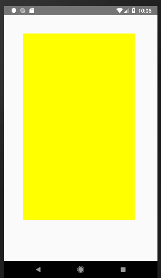
Method I: flex
We can do this in several ways. Suppose that parent has 300 width and 500 height, and is red. Our baby element will be yellow. Its dimensions will be set to flex: 1, which will completely cover the parent. Code:
Please note that ‘100%’ must be quoted, otherwise it will not work.
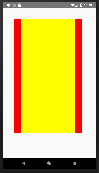
How to set view width and height to screen width / height in React Native?
Often setting the view dimensions “rigidly” is not a good idea. First of all, because we do not know on which device our application will be used, and these have different dimensions. If we adjust the appearance of the elements to the small screen of the phone, and the user will use the tablet, then the created elements will not scale and will be too small in relation to the size of the screen. To adjust the appearance to different screen sizes you need to use something “universal”.
Najlepiej więc od razu ustawić szerokość lub wysokość elementu taką samą, jaką posiada ekran. Poza poznaną już wcześniej metodą flex: 1, możemy użyć metody, która odczytuje wymiary ekranu i takie same ustawia dla elementu View. Dla szerokości będzie to zapis: Dimensions.get(‘window’).width
It’s good to set the view width or height the same as the screen has. We can do it with flex method or we can use a method that reads the screen dimensions and sets the same for the View element. For the width it will be the following: Dimensions.get(‘window’).width
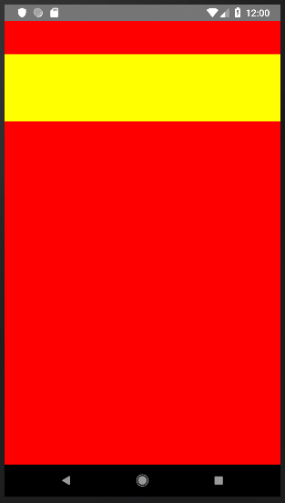
Takie ustawienie szerokości sprawia, że element dopasowuje się do szerokości ekranu za każdym razem, kiedy jest odświeżany na nowo. Jednak obrócenie ekranu z pozycji pionowej do poziomej nie zmienia stanu ani właściwości przekazanych do komponentu (props-ów), więc nie następuje odświeżenie. Zatem zmieniając pozycję z pionowej na poziomą szerokość elementu view odczytana z ekranu pozostanie niezmienna, mimo, że szerokość samego ekranu zmieni się. Będzie to wyglądało jak poniżej:
Setting width like that means that the element match the screen width every time it is refreshed. However, rotating the screen from vertical to horizontal position does not change the state or properties passed to the component (props), so there is no refresh. Therefore, changing the position from vertical to horizontal do not change the view width, although the width of the screen itself will change. It will be looking like this:
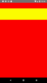
Jak temu zaradzić? Trzeba dostosować element view do szerokości ekranu dynamicznie. Za każdym razem, kiedy ekran zostanie odwrócony, element view dostosuje swoją szerokość na nowo.
How to fix it? We need to matching the view element dynamically to the screen width. Each time the screen is inverted, the view element will match to its new width.
How to set width / height of view dynamically?
Method I: onLayout
By setting the onLayout property to the view element, which is extended to the entire screen (flex: 1), each time its height or width changes, we can read it again.
Depending on the complexity of our application, the first method will not always work. Then we can use another method – to set a “listener” which will be reacting to changes in screen dimensions and saving them to the component state.
I write code that (usually) works. I tame WordPress, learn React, explore the world of DevOps, and click around in the Linux console. I optimize code as a hobby, because laziness is the purest form of productivity. I do my best not to lose my mind somewhere between a bug and a deadline.
