Responsive images in HTML5, using srcset
Images often are problematic while we creating web page . Displaying larger image on larger screen is a better for user experience, but displaying large photo on small screen, e.g. on a phone, may unnecessarily delay page loading.
Therefore, a good solution is to “serve” images with different sizes and weight for different screens.
This effect can be achieved using e.g. Javascript, but it’s easier to do it in HTML5, using the srcset attribute.
Responsive web design – different images on different devices
Case I
To display images with different sizes on different screens, we must first have several copies of image – in different sizes. After that, all we have to do is specify the photo sources and screen sizes.
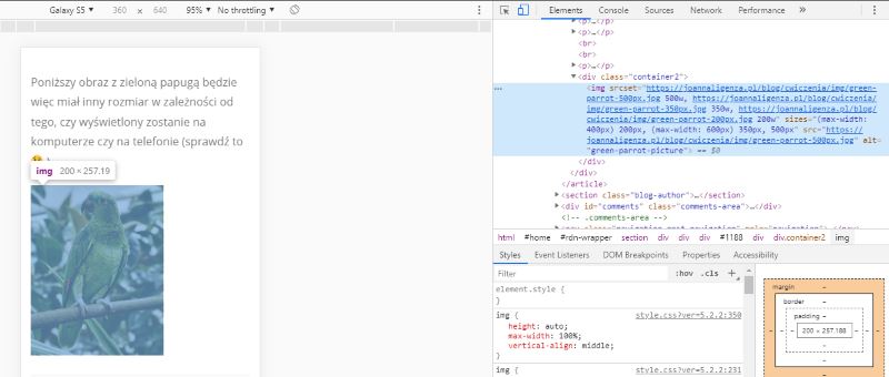
<div class="container2">
        <img srcset="green-parrot-500px.jpg 500w, green-parrot-350px.jpg 350w, green-parrot-200px.jpg 200w"
            sizes= "(max-width: 400px) 200px, (max-width: 600px) 350px, 500px"
            src="green-parrot-500px.jpg"
            alt="green-parrot-picture" />
</div>
The srcset attribute tells the browser what images are available for display and what are their dimensions. Dimensions are given in units: w (wide), not in pixels.
The sizes attribute tells the browser how to adjust individual images to the given screen sizes (a bit like media queries). The last value for the sizes attribute does not have the condition which specifying a screen size. It is used by default for all undefined screen sizes.
The src attribute displays the image when the browser does not support the srcset attribute.
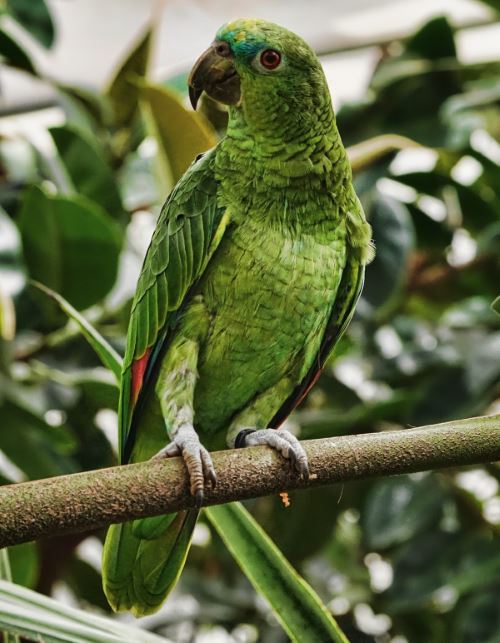
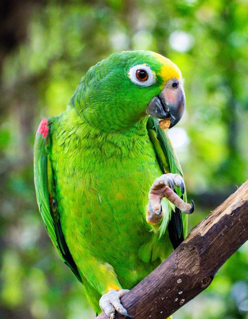
The image below with the green parrot will have a different size depending on whether it is displayed on the computer or on the phone (check it out 😉 ).
Case II
The second method seems a bit simpler (at least for me). We place our picture within picture tag, giving the source for each screen size for which we want to display a picture. We can also display different pictures depending on the screen resolution.
Code looks like this:
<picture>
        <source media="(max-width: 400px)" srcset="green-parrot-200px.jpg">
        <source media="(max-width: 600px)" srcset="green-parrot-350px.jpg">
        <img src="green-parrot-500px.jpg" style="width:auto" alt="green parrot picture">
</picture>
Thanks the code above, on screens up to 400px will be displayed image with 200px width, on screens between 401px and 600px will be displayed image with 350px width, and image with 500px width will be displayed on the other screens.
Change the width of the browser window and see what parrots are waving to you today 😉